Kickstarter Book Totes: Three Design Ideas for Author Campaigns
A book tote is the natural reward for an author or publisher campaign, and there are three workable design routes: a typographic tote carrying a line from the book, an illustrated tote carrying the cover art, and a structured tote built around the book itself with a sleeve that holds it upright. Each has a different print method, a different fabric and a different cost. Minimum order is 500 pcs per style and per colourway, sampling runs 6 to 10 working days, bulk runs 35 to 50 days, and inspection holds at AQL 2.5.
- Why book totes convert on author campaigns
- Design idea one: the quote tote
- Making typography work on fabric
- Design idea two: the cover art tote
- What illustration survives on fabric
- Design idea three: the structured book tote
- Sizing for hardback, paperback and omnibus
- Fabric choice for a book tote
- Print method for each of the three routes
- Reward tier design for an author campaign
- Timing a tote around a book launch
- QC and packing for a book tote
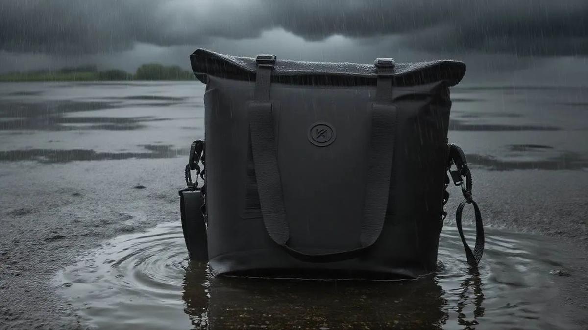
Why book totes convert on author campaigns
An author campaign sells a book, and the reward ladder around a book has a specific problem: the hero product is cheap. A hardback retails at a price that leaves very little room for a pledge premium, so the value in the ladder has to come from objects around the book rather than from the book itself. A tote is the best of those objects, because it is the one piece of merchandise a reader will actually carry in public, and carrying it is free advertising for the book.
The second reason is that readers identify with books in a way they do not identify with most products. A tote carrying a line from a novel is not merchandise, it is a signal of membership, and that is why book totes outsell almost every other item in an author campaign when they are designed well. The design quality matters more here than in any other tote niche, because the backer is buying the design rather than the bag. A generic tote with a logo on it will not convert on a literary campaign.
The third reason is practical. A book tote ships flat, weighs little, and packs with the book in the same carton, which means it adds almost nothing to fulfilment cost and often nothing at all to shipping weight if it is packed inside the book parcel. That makes it the highest-margin physical reward available to most author campaigns. Our team has supported 20 plus crowdfunding campaigns and the book and publishing ones consistently show the strongest ratio of perceived value to landed cost, which is why we recommend starting here. The crowdfunding bag guide covers the wider category.
On an author campaign the backer is buying the design, not the bag. Design quality decides conversion more than specification does.
Design idea one: the quote tote
The quote tote carries a line from the book, set in type, on the front panel. It is the cheapest of the three routes to produce, the fastest to sample, and the most likely to be carried in public, because it reads as a statement rather than as advertising. The design risk is that it can look like a mass-market slogan bag if the typography is weak, which is why this route should be treated as a typography project rather than a printing job.
Choosing the line is a design decision with commercial consequences. The ideal quote is short enough to read across a panel at arm's length, recognisable to someone who has read the book, and intriguing to someone who has not. Lines of five to twelve words work; paragraphs do not. Lines that require context fall flat. Our recommendation is to shortlist three, mock them up at actual panel size, and show them to a handful of readers before committing, because the difference in response between two candidate lines is often dramatic and unpredictable.
- Length: five to twelve words reads across a panel at arm's length
- Hierarchy: one line of emphasis, the rest subordinate
- Attribution: a small author or title line beneath, set small and quiet
- Colour: high contrast, because a bag is read at a distance and in poor light
- Test it: print the mock-up at full size and pin it to a real bag
The production advantage of this route is that a typographic design is a one or two colour screen print, which is the cheapest print that produces a crisp result. It works on canvas, on cotton and on polyester, it can be matched to a brand colour, and it does not depend on the fabric being white. That means a creator can choose the fabric for performance or for price and still have the design work, which is not true of the illustrated route.
Making typography work on fabric
Type on fabric behaves differently from type on paper, and the differences are worth designing for. Fabric has texture, so very small type and very thin strokes lose definition as the ink bridges the weave. Fabric moves, so a long line of tight type can look wavy where the panel is not perfectly flat. And a bag is viewed at a distance and at an angle, so a design that reads well on a screen at thirty centimetres may be illegible on a bag at two metres.
| Decision | Safe choice | Risky choice | Why |
|---|---|---|---|
| Minimum type size | Comfortably above 8 pt equivalent at panel size | Small caption type | Ink bridges the weave at small sizes |
| Stroke weight | Medium to bold | Hairline serif strokes | Thin strokes break up on a woven surface |
| Line length | Short lines, generous leading | Long justified blocks | Panels are rarely perfectly flat |
| Contrast | High contrast against the fabric | Tone on tone | Bags are read at a distance and in poor light |
| Coverage | Solid blocks of colour | Fine halftone gradients | Screen print bands gradients on fabric |
The practical safeguard is a full-size proof on the actual fabric. A digital mock-up looks clean because a screen has no weave. Our team produces a printed strike-off at full panel size for typographic designs and photographs it at reading distance as well as at arm's length, because a line can be legible up close and disappear at two metres. That check costs nothing at strike-off stage and it is the difference between a tote people read and one they do not.
Design idea two: the cover art tote
The second route carries the cover art, which is the obvious choice for an illustrated book and the one most creators reach for first. It works beautifully when the cover is bold and graphic, and it works badly when the cover is a photographic image with subtle tonal range, because fabric does not reproduce subtlety the way coated paper does. The decision therefore starts with an honest look at the artwork rather than with the assumption that the cover should be used.
There are two ways to handle a cover that does not reproduce well. The first is to commission a simplified version, reduced to fewer colours and stronger shapes, which is usually a modest design fee and produces a better bag. The second is to take a single element from the cover, a motif, a symbol, a repeated pattern, and build a design around it. Both are better than printing a complex image at a size and on a surface that flattens it.
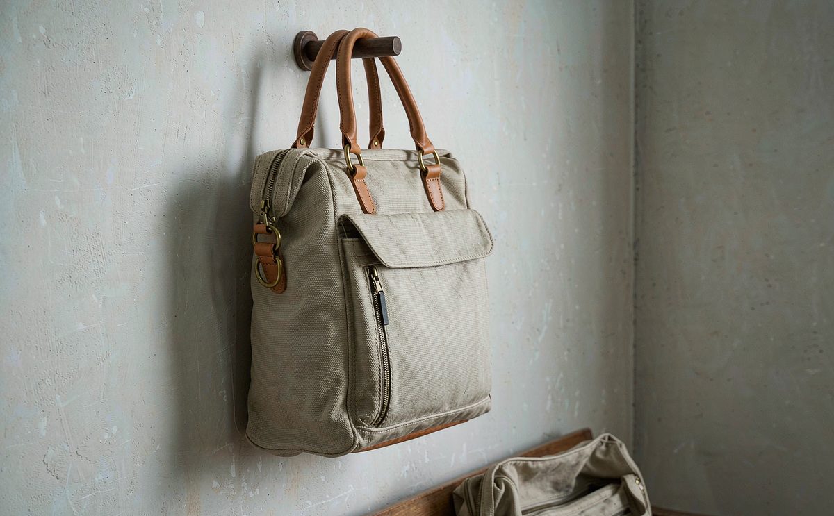
What illustration survives on fabric
Illustration survival comes down to three properties: contrast, scale and colour count. High contrast survives because fabric flattens tonal range. Large shapes survive because fine detail fills in with ink or dye. A limited palette survives because each additional colour adds a screen pass and a registration risk on a soft substrate. An illustration with those three properties looks close to the original on a bag. One without them looks like a photocopy.
- Contrast: if it depends on subtle tonal shifts, simplify it
- Scale: fine detail below a few millimetres will fill in
- Colour count: each additional colour adds cost and registration risk
- Edges: clean shapes register better than soft feathered edges
- Background: a flat field prints more reliably than a textured one
The colour reproduction question deserves a specific note for illustrated work. Screen print matches a specified reference colour accurately, which suits a design built on brand or cover colours. Sublimation reproduces a full tonal image but shifts slightly from screen to press, which matters when a cover has a signature colour. The fix is the same in both cases: a strike-off on the production fabric, approved against the cover artwork side by side, before anything goes to bulk.
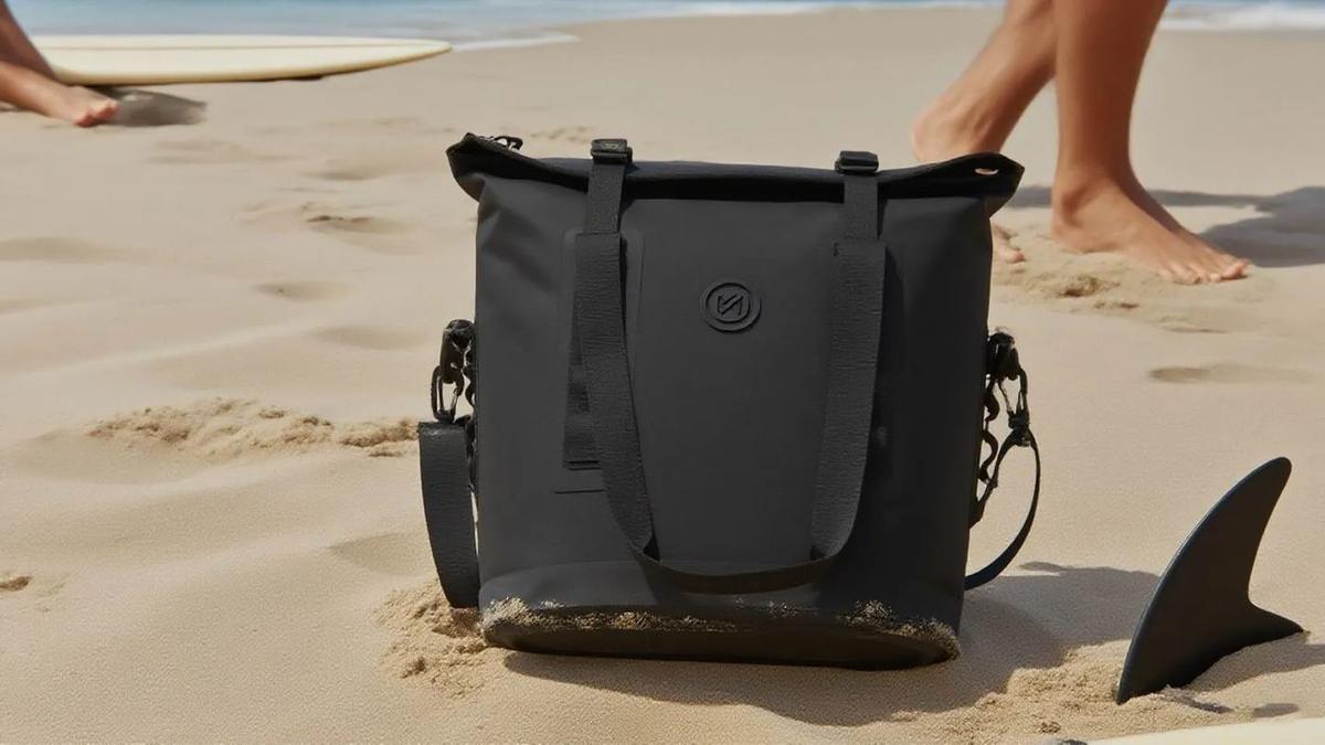
Design idea three: the structured book tote
The third route is the most interesting and the least used. Rather than printing a book design onto a generic tote, the bag is built around the book: a structured tote with a rigid base, a rectangular footprint sized to a hardback, and an internal sleeve or divider that holds one or two books upright so they do not slide to the bottom and bend. It is a book bag in the literal sense, and it is a genuinely useful object for anyone who carries a book and a laptop to a cafe.
The specification follows from that promise. The base has to be rigid and sized to the footprint of a hardback. The body has to be tall enough for the book plus clearance and stiff enough to hold its shape with a book in it or out of it. The sleeve has to be cut to the book dimensions rather than to a generic pocket size, so the book stands rather than slumps. And the handles have to be comfortable under a load that includes a hardback, which is heavier than most people expect.
The commercial argument for this route is that it is defensible. Anyone can print a quote on a tote; a bag that is designed to carry a specific format is a product rather than merchandise, and it supports a higher pledge level. It costs more to make, because of the base board, the heavier fabric and the sleeve, but the margin at a higher tier is usually better than the margin on a cheap printed tote. Our team recommends this route for campaigns that already have a strong pre-launch audience, and it is the version that benefits most from an early sample prototyping round, because the sleeve has to be cut to a real trim size.
- Hardback footprint
- Roughly 140 x 215 mm, larger for some formats
- Internal height
- Book height plus 20 to 30 mm clearance
- Base
- Rigid board in a sleeve, cut to the book footprint
- Sleeve
- Cut to the book dimensions so it stands upright
- Fabric weight
- Heavier than a flat tote, to hold shape
- Load test
- Carry with a hardback and a laptop inside
Sizing for hardback, paperback and omnibus
Book formats are the constraint on this whole category, and they are not interchangeable. A standard paperback is narrower and shorter than a hardback, an omnibus or collector's edition can be substantially larger, and a campaign that ships more than one format has a decision to make. The safe approach is to size the bag to the largest format the campaign will ship, because a bag that is slightly generous is useful and a bag that is slightly tight is returned.
| Format | Typical size | Bag implication | Note |
|---|---|---|---|
| Standard paperback | Around 130 x 200 mm | The baseline case | Fits most tote sizes easily |
| Standard hardback | Around 140 x 215 mm | Sets the sleeve dimension | The common reference format |
| Large format hardback | Larger in both dimensions | Sets the base footprint | Check the actual trim size |
| Omnibus or collector edition | Substantially larger | May need a separate product | Do not assume it fits |
| Multiple books | Two or three together | Width drives the gusset | Weight becomes the constraint |
The trim size should come from the printer's specification rather than from a measurement of a proof, because the finished trim can differ slightly from an advance copy. Our team asks for the printer's trim dimensions at briefing stage and cuts the sleeve to that plus clearance. Where a campaign is shipping a format that has not been finalised, the honest answer is to wait, because a sleeve cut to the wrong trim size is a defect that cannot be corrected after bulk.
Fabric choice for a book tote
Fabric choice here is driven by print and by structure. For the quote and cover art routes, the print drives it: a smooth, tightly woven surface reproduces type and illustration best, and a heavy cotton canvas is the classic choice because it holds a crisp screen print and feels substantial. For the structured route, structure drives it: a heavier canvas or a laminated polyester that holds its shape, with a rigid base and possibly an interfacing in the body panels.
Weight is the trade-off. A heavier canvas prints beautifully and holds shape but adds freight cost and makes the bag less packable. A lighter polyester prints well, costs less and ships cheaply but feels less substantial, which matters on a product that is being sold as a premium literary object. Our usual recommendation for an author campaign is a midweight canvas in the 280 to 340 gsm band: substantial enough to feel considered, light enough that the landed cost stays sensible.
Colour of the fabric matters more than creators expect. A natural or cream canvas gives a bookish, considered feel and takes a dark print beautifully. A black canvas looks modern and makes a light print pop, but a light print on black is a heavier ink layer and it will show wear sooner. A coloured canvas can clash with cover artwork. Our team sends swatches of the shortlisted colours with the strike-off so the decision is made against real material, and creators comparing the wider tote family can check how a laptop tote differs in structure and cost.
Print method for each of the three routes
Each design route has a natural print method, and choosing the wrong one is the most common avoidable cost in this category. The quote tote is a screen print: one or two colours, crisp type, any fabric colour, cheapest at volume. The cover art tote is usually a sublimation print on a light polyester panel, or a multi-colour screen print if the artwork reduces to a few flat colours. The structured book tote can use either, because it is sold on construction rather than on image.
| Route | Print method | Fabric | Cost position |
|---|---|---|---|
| Quote tote | One or two colour screen print | Canvas or cotton, any colour | Lowest print cost |
| Cover art, bold graphic | Multi-colour screen print | Canvas | Mid, rises with colour count |
| Cover art, photographic | Sublimation | Light polyester | Flat per panel, no screens |
| Structured book tote | Either, sold on construction | Canvas or laminated polyester | Structure dominates the cost |
| Mixed route, panel image | Sublimated panel on a canvas bag | Canvas with a polyester panel | Two operations, premium result |
For creators weighing the two methods in detail, the sublimation against screen print comparison sets out the cost curves and the fabric constraints. The short version for a book campaign is that typography and flat graphic art belong on canvas with a screen print, and photographic or gradient artwork belongs on polyester with sublimation, and the choice should be made before the artwork is finalised rather than after.
Reward tier design for an author campaign
An author campaign has an unusually clear ladder, because the book anchors it. The standard structure is a book-only tier, a book plus tote tier, a book plus tote plus extras tier, and a top tier that might include a signed edition or a name in the acknowledgements. The tote belongs in the second and third tiers, and it is doing two jobs: raising the pledge value above the cover price and giving the campaign something physical to photograph that is not the book.
The pricing arithmetic is tight and worth doing carefully. The book has a known cost and a known retail price, which caps what the tier can be. The tote has a unit cost and a shipping cost, and the difference between the tier price and the combined cost is the margin that funds everything else. Our team runs that arithmetic with creators before a deposit is paid, because a tier that looks generous can be loss-making once platform fees and shipping are included, and a loss-making tier is worse than no tier.
One structural note specific to this category: the tote should ship with the book, not separately. That means packing the tote folded inside the book parcel, which saves a fulfilment operation and often a shipping band. It also means the tote packing specification has to be designed for that, with a fold that survives and a polybag or band that keeps it clean. Our team plans the packing specification as part of the rewards fulfilment conversation rather than after production.
Timing a tote around a book launch
A book campaign has a fixed date that is not negotiable, because the publication date is set by the publisher and by a marketing calendar. That makes the tote programme a backwards-planned exercise in the same way as a seasonal product: fix the date backers should receive the reward, subtract fulfilment, subtract freight, subtract bulk, and what remains is the latest point at which sampling must finish.
Sampling runs 6 to 10 working days per round and should finish before the campaign page goes live, so the tote can be photographed with the book. Bulk runs 35 to 50 days after the deposit and the approved sample. In practice that puts the start of the tote conversation several months before the publication date, and the constraint that bites most often is not production but artwork: cover art is frequently not final when the tote needs to be specified. Where that happens, the solution is to specify the bag and the print method, hold the artwork, and accept a slightly later strike-off.
QC and packing for a book tote
Inspection holds at AQL 2.5 to ISO 2859-1, and a book tote has three checks that matter more than the generic ones. The first is print legibility at distance on typographic designs, which is a visual check against the approved strike-off carried out at arm's length rather than at close range. The second is registration on multi-colour cover art, because a shifted colour on an illustration is immediately visible to a reader who knows the original. The third is dimensional accuracy on the structured route.
On the structured book tote there is one additional check that is specific to the product: the book fit test. Take the actual finished book, or a dummy cut to the printer's trim size, and put it in the sleeve. It should stand upright, come out easily, and leave the bag able to close. If it is tight on the sample it will be tighter in bulk. Our team runs this with a dummy at sampling stage so the sleeve can be adjusted before the pattern is frozen.
Packing for this category is unusually simple and worth getting right. A flat tote folds, bands or polybags, and ships inside the book carton, which keeps the fulfilment cost near zero and the parcel weight almost unchanged. A structured tote with a base board does not fold as small and may need its own carton, which changes the economics. Our team flags that difference at quote stage, because it is the sort of detail that turns a cheap reward into an expensive one. The full checklist is in the campaign QA and QC guide.
Key takeaways
- P
- i
- c
- k
- o
- n
- e
- o
- f
- t
- h
- r
- e
- e
- r
- o
- u
- t
- e
- s
- e
- a
- r
- l
- y
- :
- t
- y
- p
- o
- g
- r
- a
- p
- h
- y
- o
- n
- c
- a
- n
- v
- a
- s
- w
- i
- t
- h
- a
- s
- c
- r
- e
- e
- n
- p
- r
- i
- n
- t
- ,
- c
- o
- v
- e
- r
- a
- r
- t
- o
- n
- p
- o
- l
- y
- e
- s
- t
- e
- r
- w
- i
- t
- h
- s
- u
- b
- l
- i
- m
- a
- t
- i
- o
- n
- ,
- o
- r
- a
- s
- t
- r
- u
- c
- t
- u
- r
- e
- d
- b
- a
- g
- s
- i
- z
- e
- d
- t
- o
- t
- h
- e
- p
- r
- i
- n
- t
- e
- r
- '
- s
- t
- r
- i
- m
- w
- i
- t
- h
- a
- s
- l
- e
- e
- v
- e
- t
- h
- a
- t
- h
- o
- l
- d
- s
- t
- h
- e
- b
- o
- o
- k
- u
- p
- r
- i
- g
- h
- t
- .
Send us your trim size, artwork and launch date, and our production team will build the specification and quote a book tote programme for custom tote bags.
Frequently Asked Questions
What is the minimum order for a book tote?
500 pcs per style and per colourway. A campaign offering the tote in two colourways is committing to two runs. Most author campaigns launch a single colourway that suits the cover artwork and hold a second for a later reprint or a sequel.
Which of the three design routes is cheapest?
The quote tote. A one or two colour screen print on canvas is the lowest-cost print that still produces a crisp result, and it works on any fabric colour. The cover art route costs more, and the structured book tote costs most because of the base board, heavier fabric and sleeve.
Can I print my book cover on a tote?
If the cover is bold and graphic, yes, and it reproduces well. If it is a photographic image with subtle tonal range, it will flatten on fabric. In that case commission a simplified version or take a single motif from the cover and build a design around it.
What fabric suits a book tote?
A midweight canvas in the 280 to 340 gsm band is the usual recommendation. It feels substantial, holds a crisp screen print and keeps the landed cost sensible. Lighter polyester prints well and ships cheaply but feels less premium, which matters on a literary product.
How do I size a tote for a hardback?
Use the printer's trim size, not a measurement of a proof, because the finished trim can differ slightly. Cut the sleeve to that plus clearance so the book stands upright and comes out easily. Size to the largest format the campaign ships, because a generous bag is useful and a tight one is returned.
How long does sampling take for a book tote?
6 to 10 working days per round for a standard build, and 12 to 15 for a structured bag with a base board and a sleeve. The common constraint is not sewing but cover artwork that is not final, in which case the bag and print method are specified and the strike-off follows.
Should the tote ship with the book?
Yes, almost always. A flat tote folded inside the book carton adds almost nothing to fulfilment cost and often nothing to parcel weight. A structured tote with a base board may need its own carton, which changes the economics and should be flagged at quote stage.
How do I check the print quality before bulk?
Request a strike-off on the production fabric at full panel size and view it at arm's length as well as close range. Type can be legible up close and disappear at two metres. Approve against the cover artwork side by side and hold the approved sample as the reference.
What type size works on a tote?
Comfortably above an 8 pt equivalent at panel size, with medium to bold stroke weights. Thin strokes bridge and break on a woven surface, and small caption type fills in. High contrast matters because a bag is read at a distance and in poor light.
What is a book fit test?
The finished book, or a dummy cut to the printer's trim size, is placed in the sleeve of a structured book tote. It should stand upright, come out easily and leave the bag able to close. Our team runs it at sampling so the sleeve can be adjusted before the pattern is frozen.
How should a book tote be priced in a reward tier?
Price it against the combined cost of the book and the tote plus shipping and platform fees. The book's retail price caps what the tier can be, so the arithmetic has to be done before the tier is published. A tier that looks generous can be loss-making once fees are included.
What inspection applies to a book tote order?
AQL 2.5 to ISO 2859-1, with emphasis on print legibility at distance, registration on multi-colour cover art, and dimensional accuracy on structured bags. Structured totes also get a book fit test with a dummy cut to the printer's trim size.
People Also Ask
Are book totes a good reward for author campaigns?
Yes. The hero product is cheap, so value has to come from objects around the book, and a tote is the one piece of merchandise a reader carries in public. It also ships flat and packs with the book, so fulfilment cost is near zero.
What should I put on a book tote?
Three options work: a short line from the book set in type, the cover art if it is bold and graphic, or nothing at all if you are building a structured bag sized to the book itself. Avoid paragraphs and low contrast artwork.
Can I print a photograph on a tote?
Yes by sublimation on light polyester, but subtle tonal range flattens on fabric. For a photographic cover, either accept a softer result or reduce the image to a stronger, higher contrast version before printing.
How big should a book tote be?
Sized to the largest format the campaign ships. A standard hardback is around 140 by 215 mm, and the internal height should be the book height plus 20 to 30 mm clearance. Always work from the printer's trim size.
Should the tote be natural or black canvas?
Natural or cream reads bookish and takes a dark print beautifully. Black looks modern but a light print on black is a heavier ink layer and shows wear sooner. Send for swatches and decide against real material.
When should I start sampling for a launch date?
Several months before publication. Sampling needs 6 to 10 working days per round and should finish before the page goes live, then bulk needs 35 to 50 days. Work backwards from the date backers should receive the reward.
Can I sell the tote after the campaign?
Yes, and many authors do. Keep the golden sample, the specification and the layered artwork files so a re-order can be quoted in days and timed to a paperback release or a sequel.