Custom Bag Colour Matching: Pantone, Lab Dips and Fabric Dye Lots
A Pantone reference is a target for an ink on paper, not a formula for a dye on polyester. Colour matching on a bag works in three steps: the reference sets the target, a lab dip is produced on the actual fabric to show what is achievable, and the approved physical swatch becomes the standard the bulk run is measured against. Expect a tolerance rather than an exact match, and expect dye lot variance between the sample and the bulk run that is normal, measurable and manageable if you plan for it.
- Why Pantone alone is not a colour specification
- From Pantone reference to lab dip on the actual substrate
- Reading a lab dip: delta E and tolerance in plain terms
- Dye lots and why bulk never matches the first sample exactly
- Colour fastness tests that matter for reward bags
- Choosing colours that survive production and photography
- Matching hardware coating and webbing to the shell fabric
- Colour approval workflow and who signs off
- Metamerism, lighting and the approval environment
- Building a colourway plan that respects the 500 pcs minimum
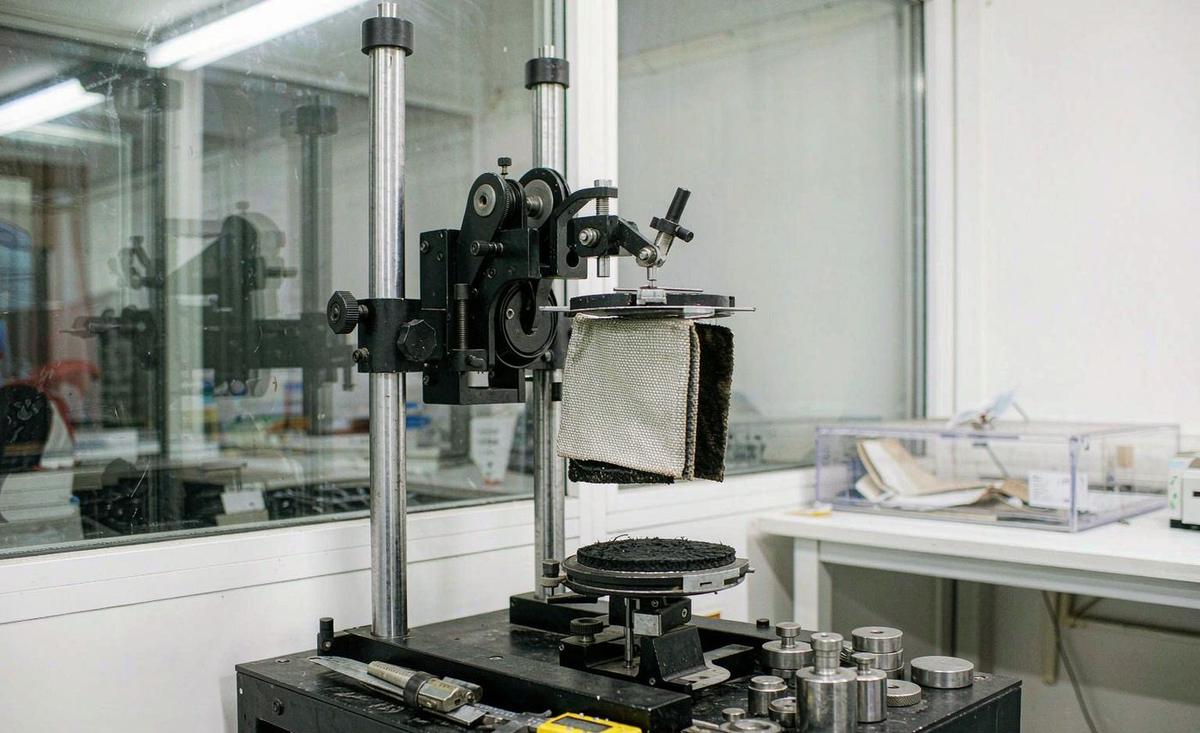
Almost every colour problem in this category starts in the same place: a creator sends a Pantone reference, the sample arrives, and the fabric is visibly not that colour. The reaction is that the match failed. In most cases the match did not fail, because a Pantone chip is a specification for pigment printed on coated paper, and the bag is dye absorbed into a polymer or a natural fibre. The two are different physics. A colour that is trivial to hit in ink can be difficult or impossible to hit in a disperse dye on polyester, and a colour that is easy on polyester can be impossible on nylon, because the two fibres take dye differently.
That does not make the reference useless. It makes it a direction rather than a formula, and the workflow exists to convert the direction into something physically achievable on your actual material. The three-step sequence our production programme runs is: the reference sets the target, a lab dip is produced on the specified fabric to show what is achievable and at what closeness, and the approved physical swatch becomes the standard that the bulk dye lot is measured against. Understanding which of the three you are looking at removes most of the argument.
The stakes are higher for a crowdfunding creator than for a wholesale buyer, for one specific reason: your backers have been looking at your campaign page for months. They have a colour in their head from a render or a photograph taken in a studio under controlled light. If the delivered bag is two shades off, they will notice, and they will say so publicly. Colour is the single most common complaint in reward bag reviews, and it is almost entirely a process problem rather than a capability problem. The full sampling sequence is covered in our crowdfunding bag sample and prototyping guide.
Approve colour against a physical swatch of the production fabric, under defined lighting, and keep that swatch. A reference number on a specification sheet is a direction, not a standard.
Why Pantone alone is not a colour specification
A Pantone reference describes the appearance of a specific ink film on a specific paper stock, viewed under a defined light source. Change the ink, the substrate or the light, and the same reference number describes something that looks different. Fabric introduces three additional variables the reference does not account for. The first is fibre type: polyester, nylon, cotton and blended fabrics each take dye through a different mechanism and have a different achievable gamut. A saturated teal that is routine on polyester can be unobtainable on nylon at any price.
The second variable is surface and finish. The same dye on a plain weave, a twill, a ripstop and a brushed tricot produces four different perceived colours, because the surface geometry changes how light is reflected before it ever reaches the dye. A polyurethane-coated fabric shifts further, because the coating sits on top of the dye and adds its own cast. A matte finish reads darker than a gloss finish in the same dye. This is why a swatch has to be produced on the exact fabric, with the exact coating, rather than on a generic test piece.
The third variable is depth of shade and fastness. A very dark or very saturated shade may only be achievable with a dye combination that has poor light fastness or poor rub fastness, meaning it fades or crocks. The colour is achievable and the product is not sellable. This is the conversation that a good colour programme has with you early: not can we hit it, but can we hit it and pass the fastness requirements for the intended use. Our team flags this at lab dip stage rather than after the bulk is dyed.
The practical implication for a specification is that a colour line should carry three pieces of information rather than one: the reference as the target, the substrate it has to be achieved on, and the acceptable tolerance. A specification that says only Pantone 19-4052 is incomplete. One that says Pantone 19-4052 on 600D polyester with PU coating, aiming within delta E 2.0, fastness to light grade 4 or better is a specification someone can be held to. Writing that line takes two minutes and prevents the most common dispute in the category.
From Pantone reference to lab dip on the actual substrate
A lab dip is a small piece of the actual production fabric, dyed in a laboratory to approximate the reference. It is produced in a small vessel under controlled conditions, which means it is indicative, not identical to bulk, because bulk is dyed in a large machine with different liquor ratios, different heating profiles and different dwell times. A competent colour programme accounts for this by dyeing the lab dip in a way that anticipates the bulk shift, and by confirming on the first bulk dye lot rather than assuming the translation holds.
A lab dip round normally produces two to four options rather than one. The reason is that there is rarely a single formula that reaches a reference; there are several, and they differ in metamerism, in fastness and in cost. One may be closer under daylight and further away under store lighting. One may use a cheaper dye combination with slightly lower fastness. One may be achievable with a shorter process. Seeing the options lets you choose on the criteria that matter to your product rather than accepting the first formula that came close.
Turnaround is the planning number that surprises people. A lab dip round typically takes 5 to 10 working days, and a second round takes the same again. That is in addition to the 6 to 10 working days for the sample build, not inside it, because the fabric has to be dyed before it can be cut. A first-time creator planning a two-round colour approval plus a two-round sample build is looking at roughly 6 to 9 weeks of calendar time, and a complex build at 12 to 15 working days per round pushes that further. Plan the colour approval as its own workstream.
There is a shortcut that is legitimate and worth knowing. Where a fabric is available in a stock colour range, a stock colour can be used instead of a custom dye, which eliminates the lab dip entirely and removes the dye lot risk for the first run. The trade-off is that you are choosing from what is available rather than from your brand palette. For a first campaign this is often the right decision: the fastest route to a colour that will be consistent across 500 pcs is frequently a stock colour, and a stock colour can be custom-dyed on the re-order once the volume justifies it.
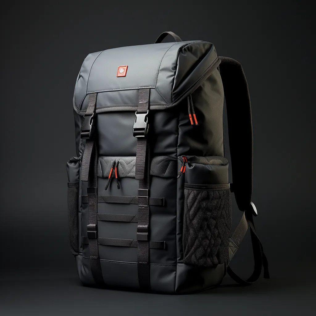
Reading a lab dip: delta E and tolerance in plain terms
Colour difference is measured as delta E, a single number describing the distance between two colours in a defined colour space. The scale is not linear in perception, but the working thresholds are well established. A delta E of under 1.0 is generally imperceptible to an untrained eye under good conditions. 1.0 to 2.0 is a very close match that most people will not notice on a sewn product. 2.0 to 3.5 is visible on a side-by-side comparison but usually acceptable on a finished bag. Above 4.0 is a different colour and will be noticed.
The number you should specify depends on the material and the colour. On polyester with a standard finish, a target of delta E 1.5 or better is a reasonable specification and is usually achievable. On nylon, on a coated fabric, or on a very saturated or very dark shade, delta E 2.0 to 3.0 is a more realistic target, and insisting on tighter will generate rounds without improving the product. Our team tells you which band applies to your material before you commit, because specifying 1.5 on a coated nylon is a reliable way to spend three weeks discovering it is not available.
There is an important distinction between delta E against the reference and delta E against the approved swatch. The first tells you how close the lab dip is to your brand colour, which is what you care about aesthetically. The second tells you how close the bulk is to what you approved, which is what determines whether the bulk is acceptable. Specify both, and hold the bulk to the second. A bulk lot that matches the approved swatch within tolerance is conforming even if both are slightly away from the original reference, and that is the correct outcome, because the swatch is the standard.
Two practical cautions. The first is that delta E is measured with an instrument under a defined illuminant, normally D65 daylight simulation, so the number says nothing about how the colour behaves under warm retail lighting. Ask for the measurement under a second illuminant, commonly TL84 or CWF, if your product will be seen under store lighting. The second is that delta E must be measured on a flat, clean, representative area; measuring over a seam, a print or a worn spot produces a meaningless number and an argument that wastes a week.
Dye lots and why bulk never matches the first sample exactly
A dye lot is a single production batch of dyed fabric. Bulk fabric is not dyed continuously; it is dyed in batches, and every batch has some variance from the one before, because the dye bath is reconstituted, the water chemistry drifts, the temperature profile is not perfectly repeatable and the substrate itself varies slightly between rolls. This is not a defect. It is an inherent property of textile dyeing, and it is why the industry works to tolerances rather than absolutes.
The practical consequence is that your approved sample and your first bulk lot will differ slightly, and the question is only whether the difference is inside tolerance. The controls that keep it there are three. A bulk dye lot sample, sometimes called a shade band or bulk head sample, is cut from the actual production lot and sent for confirmation before cutting begins. Side-by-side comparison against the retained approved swatch, under defined lighting, is how that confirmation is made. A retained reference swatch, physically kept by both parties, is what makes the comparison meaningful.
The second consequence is within-garment consistency, which matters more than lot-to-lot variance on a multi-panel bag. A backpack uses shell fabric, lining, webbing, binding tape, mesh and possibly a second shell colour. If these are dyed in different lots, the panels will not match each other even if each individually matches its own standard. The control is to dye all components for one colourway in a coordinated programme and to approve them mounted together on one card. Our colour programme runs this as a single trim approval for exactly this reason.
The third consequence is planning across a 500 pcs per style and colourway structure. If your run is two colourways of 500 pcs each, each colourway is its own dye lot or lots, and each needs its own confirmation. If a colourway is small enough that it does not fill a dye vessel efficiently, the per-unit cost of the fabric rises and the variance risk increases, which is one of the practical reasons the minimum exists. Where a colourway is marginal, the honest advice is usually to consolidate two similar shades into one rather than run a third lot. Our team will say so when the arithmetic is against you.
Colour fastness tests that matter for reward bags
A colour that matches and then fades or transfers is worse than one that never matched. Colour fastness is the set of standardised tests that predict how a dyed fabric behaves in use, and four matter for a reward bag. Fastness to light measures resistance to fading under exposure, rated on a blue wool scale from 1 to 8 where 8 is best; a bag fabric should generally achieve grade 4 or better, and higher for a product that will sit in a sunny window.
Fastness to rubbing, also called crocking, measures colour transfer when the fabric is rubbed, and is rated on a grey scale from 1 to 5 where 5 is no transfer. It is tested both dry and wet, and wet rubbing is almost always the worse result. This is the test that predicts the classic complaint: a dark bag that leaves colour on a light-coloured shirt. A result of grade 4 dry and grade 3 to 4 wet is a reasonable expectation for a dyed polyester; below that, the colour will transfer in use.
Fastness to washing and fastness to perspiration matter less for a bag than for a garment but are relevant for a gym bag, a cycling pack or anything that will be worn against the body for extended periods. Fastness to water matters for a travel or beach product. Each is rated on the grey scale 1 to 5. The useful approach is to specify the tests that match the intended use rather than commissioning everything, because a full test programme on a multi-material bag is a real cost and most of it will not be relevant to your product.
Two process notes. Testing is done by an accredited third-party laboratory and takes roughly 5 to 10 working days, which is a separate workstream from the lab dip and should be planned alongside it. And testing must be done on the final production material, not on a development sample, because a coating applied after dyeing changes the result. Our team commissions the relevant tests at bulk fabric approval and provides the reports with the inspection documentation, because a backer who asks about colour transfer deserves an answer with a number in it.
| Test | Standard method | Scale | Working target | Why it matters |
|---|---|---|---|---|
| Fastness to light | ISO 105-B02 | Blue wool 1 to 8 | Grade 4 or better | Predicts fading in a sunny window or on a shelf |
| Fastness to rubbing, dry | ISO 105-X12 | Grey scale 1 to 5 | Grade 4 or better | Predicts colour transfer onto clothing |
| Fastness to rubbing, wet | ISO 105-X12 | Grey scale 1 to 5 | Grade 3 to 4 | Worse than dry; the usual failure point |
| Fastness to washing | ISO 105-C06 | Grey scale 1 to 5 | Grade 4 or better | Relevant for gym, cycling and washable products |
| Fastness to perspiration | ISO 105-E04 | Grey scale 1 to 5 | Grade 4 or better | Relevant for anything worn against the body |
| Fastness to water | ISO 105-E01 | Grey scale 1 to 5 | Grade 4 or better | Relevant for travel, beach and outdoor products |
Choosing colours that survive production and photography
Some colours are simply easier to produce and live with than others, and choosing with that in mind costs nothing. Mid-tone colours are the most forgiving. A saturated mid-tone hides dye lot variance better than a pale shade, where a small difference in depth reads as a different colour, and better than a very dark shade, where the variance shows as unevenness across panels. Neutrals are the second-easiest, because grey, black and navy have well-established formula libraries and the achievable tolerance is tighter than on a bright fashion shade.
The genuinely difficult families are worth knowing before you commit. Very bright saturated oranges, limes and some cyans push the gamut of disperse dyes on polyester and often cannot reach the reference at all. Very pale pastels show every variation in the substrate and in the dye bath, and are the most likely to produce visible panel-to-panel differences. Metallic and pearlescent finishes are coatings rather than dyes and are highly sensitive to application conditions. If your brand colour sits in one of these families, build in an extra lab dip round and accept a wider tolerance.
Photography interacts with all of this. A very dark bag photographs as a shape without detail unless it is lit expensively, which means your campaign page will show less of the product than you want. A very light bag shows every handling mark in transit and will photograph dirty. A high-saturation colour can be difficult to reproduce accurately on a screen, which means backers see a different colour on their phone than you see on your calibrated monitor, and the delivered bag disappoints. The safest choice for a first campaign is a mid-tone with a considered accent colour on the lining or the zipper tape.
One specific and frequently missed point: the lining colour is the most photographed interior surface of any bag, and it is the cheapest place to add perceived value. A black shell with a contrasting lining reads as considered design, costs the same as a matching lining, and photographs extremely well in an unboxing. It also hides soiling far better than a pale lining. If you have one colour decision to make that will show up in backer photography, it is this one, and it is usually free.
Matching hardware coating and webbing to the shell fabric
A bag is rarely one colour. It is a shell, a lining, webbing, binding tape, mesh, zipper tape, thread and metal hardware, and each is coloured by a different process. Thread is the one most often forgotten and most visible when wrong: a contrast stitch on a seam is a design feature, but a near-miss thread colour on a topstitched seam looks like a mistake. Specify thread colour explicitly, and be aware that thread is a different fibre with a different dye range, so a thread matched to a polyester shell will rarely be an exact match.
Webbing is usually polyester or nylon and is dyed in its own lots. A webbing that matches the shell on the sample may not match on the bulk run if the two were dyed separately. The control is the trim card: a single board mounting the shell, the lining, the webbing, the binding, the tape and a thread wrap, all approved together from the same dye programme. Our programme coordinator issues this as a physical card with a sign-off sheet, and it is the single most useful artefact in colour approval. Where a fourth shade is wanted later, our stretch goal colourway guide explains how to unlock it without breaking the minimum.
Metal hardware is the hardest of all, because it is not dyed. As covered in our bag hardware sampling guide, anodising absorbs dye into an oxide layer and varies with the alloy and the bath, while plating deposits a metal layer with its own cast. A realistic specification gives the hardware a reference plus a range and then approves a physical sample. Where the shell is a brand colour that must be echoed in the hardware, the reliable solution is usually a powder-coated or painted part to a mixed specification, accepting that edges will wear, or a deliberate contrast such as black hardware against a coloured shell.
The sequencing matters. Approve in this order: shell first, because it is the largest area and the hardest to change; lining second, because it is the second-largest surface and the most photographed interior; webbing, tape and thread third as a group against the approved shell; and hardware last, because it has the longest lead time and the widest tolerance and therefore should be the flexible element. Approving in the reverse order, which is what happens when nobody plans it, guarantees at least one extra round.
Colour approval workflow and who signs off
Colour approval fails more often on process than on capability, and the failure is almost always too many opinions. A four-person team looking at a swatch on four different screens will produce four different answers, and none of them will match the physical fabric. The fix is to define, before the first lab dip, who approves, what they approve against, and under what light. One named approver, one physical standard, one lighting condition. Everyone else can comment, but one person signs.
The workflow our team runs has five gates. Gate one: the reference is received with the substrate and the tolerance band, and the achievable band is confirmed in writing before any dyeing starts. Gate two: the lab dip options are presented as a physical card, with instrument readings against the reference under two illuminants. Gate three: the approved lab dip is signed, cut and retained by both parties as the standard. Gate four: the bulk dye lot sample is confirmed against the retained standard before cutting. Gate five: the trim card is approved as a group.
The discipline that matters most is at gate three. A signed, dated, physically retained swatch is the only artefact that settles a colour dispute, because everything else is a description of a colour rather than the colour. Our programme coordinator keeps the retained swatch with the production file for the life of the programme, and the bulk inspection includes a comparison against it. Where a creator has kept their own half of the swatch, disagreements resolve in minutes. Where neither party kept one, they resolve in weeks and usually end in a commercial compromise.
Timing should be built into the campaign calendar rather than discovered. A realistic plan is two lab dip rounds at 5 to 10 working days each, plus one bulk lot confirmation, plus one trim card round, which is roughly 4 to 6 weeks running in parallel with the pattern work but before the first sample build. Against a sampling window of 6 to 10 working days per round, colour is therefore a longer lead item than the build itself. Campaigns that run out of time on colour are the ones that counted only the build.
Metamerism, lighting and the approval environment
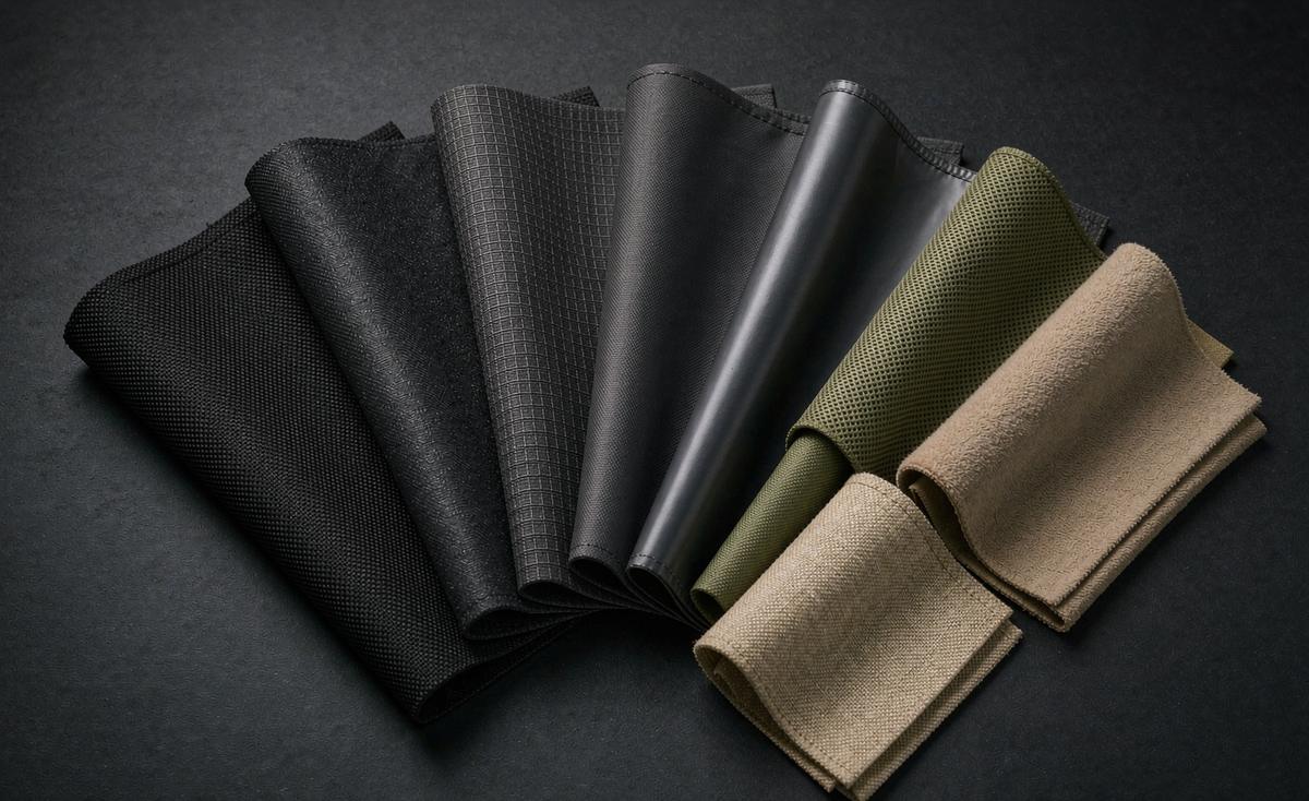
Metamerism is the reason two colours can match perfectly under one light and visibly differ under another. It happens when two samples reflect light differently across the spectrum but produce the same perceived colour under a particular illuminant. It is not a defect and it is not rare; it is a normal consequence of using different dye combinations to reach the same target. This is why the lab dip round that gives you options rather than a single answer is genuinely valuable: the options differ precisely in how they behave under different light.
The practical defence is to view under at least two illuminants before approving. The standard pairing is D65, which simulates average daylight, and TL84 or CWF, which simulate typical retail fluorescent lighting. A third useful check is warm domestic incandescent or LED, because that is where your backer will open the box. A colour that matches under D65 and drifts under TL84 is a metamerism risk, and it should be rejected at lab dip stage rather than discovered on the delivered product.
The viewing environment matters as much as the light source. Approve in a light booth or a neutral grey environment, not at a desk next to a bright window, not on a wooden table and not while wearing a brightly coloured shirt, all of which reflect into the sample and shift the perception. The samples should be viewed flat, clean and at a consistent angle, and the comparison should be edge to edge with no gap, because a gap between two swatches makes small differences much harder to judge accurately.
One more caution that is specific to remote approval, which is how most of this works in practice. Never approve colour from a photograph or a screen. A camera applies white balance automatically, a screen is calibrated to an unknown standard, and the result can differ from the physical fabric by more than the entire tolerance band you are trying to judge. Ask for the physical card to be posted, look at it yourself under decent light, and only then sign. The 5 to 7 days of courier time that this costs is far cheaper than a 35 to 50 day bulk run in the wrong shade.
Building a colourway plan that respects the 500 pcs minimum
The 500 pcs per style and colourway minimum is the constraint that shapes every colourway decision, and it interacts with colour in a specific way: each colourway is its own dye lot, its own webbing lot and its own trim programme. That means a three-colourway campaign is three times the colour approval work, not one third more. It also means a colourway that does not reach 500 pcs either cannot be run or carries a cost premium that the reward pricing has to absorb.
The planning rule that follows is to let the backers choose from a short list and let the numbers decide. A campaign can offer four colourways as a preference survey and then produce the two or three that clear the minimum, provided the campaign page says clearly that final colourways are subject to demand. This is standard practice in the category and backers accept it. What they do not accept is a colourway being dropped after they pledged for it without a clear explanation, so state the rule on the campaign page before launch rather than in an update after.
Stretch goals are the usual way colourways get added, and they should be planned for in the colour programme rather than bolted on. A stretch colourway announced at USD 150,000 needs its lab dip and trim approval ready before the campaign closes, not after, because the approval cycle is 4 to 6 weeks and the bulk window is 35 to 50 days. Our team pre-approves stretch colourways during the campaign where a creator expects to unlock them, which is the difference between a stretch colourway that ships with the first wave and one that ships three months later.
Finally, the re-order is where the colourway plan either pays off or costs money. A retained, signed swatch and a documented formula make a re-order straightforward: the colour can be reproduced within tolerance in the normal 35 to 50 day window. Without them, the re-order starts with a new lab dip round, which adds 2 to 4 weeks and reintroduces all the variance risk that the first round was meant to remove. Keep the swatch. It is the cheapest insurance in the entire programme, and it is the thing most commonly lost.
Send us your brand reference, fabric choice and colourway plan, and our production team will confirm the achievable tolerance band before any dyeing starts.
Key takeaways
- A
- P
- a
- n
- t
- o
- n
- e
- n
- u
- m
- b
- e
- r
- i
- s
- a
- d
- i
- r
- e
- c
- t
- i
- o
- n
- .
- T
- h
- e
- a
- p
- p
- r
- o
- v
- e
- d
- p
- h
- y
- s
- i
- c
- a
- l
- s
- w
- a
- t
- c
- h
- i
- s
- t
- h
- e
- s
- t
- a
- n
- d
- a
- r
- d
- .
- R
- e
- t
- a
- i
- n
- i
- t
- ,
- a
- p
- p
- r
- o
- v
- e
- t
- r
- i
- m
- s
- a
- g
- a
- i
- n
- s
- t
- i
- t
- ,
- a
- n
- d
- c
- o
- n
- f
- i
- r
- m
- t
- h
- e
- b
- u
- l
- k
- d
- y
- e
- l
- o
- t
- a
- g
- a
- i
- n
- s
- t
- i
- t
- b
- e
- f
- o
- r
- e
- c
- u
- t
- t
- i
- n
- g
- .
Frequently Asked Questions
Why does my dyed fabric not match the Pantone reference?
Because a Pantone chip specifies ink on coated paper, while your bag is dye absorbed into a fibre. Fibre type, weave, surface finish and any coating all shift the result. The reference sets the target; a lab dip on the actual fabric shows what is achievable, and the approved physical swatch becomes the standard. Approve the achievable band in writing before dyeing starts, so the comparison is against a number rather than an expectation.
What delta E should I specify for a bag fabric?
On standard polyester, delta E 1.5 or better is reasonable. On nylon, coated fabric or a very saturated or dark shade, delta E 2.0 to 3.0 is more realistic. Under 1.0 is imperceptible, 2.0 to 3.5 is visible side by side but usually acceptable on a finished bag, and above 4.0 reads as a different colour. Measure on a flat, clean, representative area under a defined illuminant, because a reading taken over a seam or a print is meaningless.
How long does a lab dip take?
A lab dip round typically takes 5 to 10 working days, and a second round the same again. That runs alongside, not inside, the 6 to 10 working day sample build. Plan for two rounds plus a bulk lot confirmation plus a trim card, which is roughly 4 to 6 weeks of calendar time. Plan it as its own workstream alongside the pattern work, because colour is a longer lead item than the build itself.
Why does my bulk order look different from the approved sample?
Because fabric is dyed in batches and every dye lot varies slightly. That is inherent to textile dyeing, not a defect. The control is a bulk dye lot sample cut from the production lot, confirmed against the retained approved swatch before cutting begins, with a tolerance band agreed in advance. Confirm the bulk dye lot against the retained swatch before cutting begins, which is the only control that catches the difference in time.
What colour fastness rating should I ask for?
Fastness to light grade 4 or better on the blue wool 1 to 8 scale, and rubbing grade 4 dry and grade 3 to 4 wet on the grey scale. Wet rubbing is the usual failure point and predicts colour transfer onto clothing. Add washing and perspiration tests only where the product will be worn against the body. Testing takes roughly 5 to 10 working days and must be run on the final production material, after any coating has been applied.
What is metamerism and why does it matter?
It is when two colours match under one light but differ under another, because different dye combinations were used to reach the same target. Guard against it by viewing every approval under at least two illuminants, normally D65 daylight and TL84 retail fluorescent, and rejecting a lab dip that drifts between them. Reject a lab dip that drifts between the two illuminants rather than discovering the difference on the delivered product.
Can I approve a colour from a photograph?
No. A camera applies automatic white balance and a screen is calibrated to an unknown standard, so the difference can exceed the whole tolerance band. Ask for the physical swatch card to be posted and view it yourself in a neutral environment. The 5 to 7 days of courier time is far cheaper than a 35 to 50 day bulk run in the wrong shade.
Which colours are easiest to produce consistently?
Mid-tones and neutrals. Mid-tones hide dye lot variance better than pale shades, where a small depth difference reads as a different colour, and better than very dark shades, where variance shows as unevenness. Neutrals have well-established formula libraries and a tighter achievable tolerance. Mid-tones also photograph better than very dark or very light shades, which matters for the campaign page and for backer reviews.
Which colours should I avoid for a first campaign?
Very bright saturated oranges, limes and some cyans can push the gamut of disperse dyes on polyester. Very pale pastels show every substrate and bath variation. Metallic and pearlescent finishes are coatings and are highly application-sensitive. If your brand sits in these families, budget an extra round and a wider tolerance. If your brand sits in one of these families, build in an extra lab dip round and accept a wider tolerance band from the start.
How do I match webbing, thread and tape to the shell?
Approve them as a group on a trim card against the physical approved shell swatch, all from the same coordinated dye programme. Approving each component against its own reference is the main cause of panels that match individually and clash on the finished bag. Approve them together on one card, because panels matched individually will clash once they are sewn next to each other.
Does each colourway need its own approval?
Yes. Each colourway at 500 pcs per style and colourway is its own dye lot, webbing lot and trim programme, so three colourways means three times the colour approval work. Pre-approve stretch colourways during the campaign so they can ship with the first wave. Pre-approve stretch colourways during the campaign so they can ship with the first wave rather than three months later.
What should I keep for a re-order?
The signed, dated physical swatch and the documented formula. With them, a re-order reproduces within tolerance in the normal 35 to 50 day window. Without them, the re-order starts with a new lab dip round, adding 2 to 4 weeks and reintroducing all the variance risk the first round was meant to remove. Keep the swatch with the production file for the life of the programme, because it is the cheapest insurance available and the thing most commonly lost.
People Also Ask
What is a lab dip?
A small piece of the actual production fabric dyed in a laboratory to approximate your reference. It is indicative, not identical to bulk, because bulk is dyed in large machines.
What is delta E?
A single number for the distance between two colours. Under 1.0 is imperceptible, 2.0 to 3.5 is visible side by side but usually acceptable, and above 4.0 reads as a different colour.
What is a dye lot?
A single production batch of dyed fabric. Every batch varies slightly, which is why the industry works to tolerances rather than exact matches.
Can I match Pantone exactly on fabric?
Rarely. Aim for a tolerance band, typically delta E 1.5 on polyester and 2.0 to 3.0 on nylon or coated fabric, and approve against a physical swatch.
How many lab dip rounds will I need?
Plan two. The first shows what is achievable and the second confirms the chosen formula, at 5 to 10 working days each.
What is colour fastness to rubbing?
A test of colour transfer when fabric is rubbed, rated on a grey scale from 1 to 5. It predicts the classic complaint of a dark bag marking a light shirt.
Should the lining match the shell?
Usually not. A contrasting lining costs the same, reads as considered design, photographs well in an unboxing and hides soiling better than a pale lining.
How long does colour approval take in total?
About 4 to 6 weeks: two lab dip rounds, a bulk lot confirmation and a trim card round, running alongside the pattern work and before the first build.